Let’s start with a truth most course creators learn the hard way.
You can spend six months building a course. You can record professional videos, design beautiful slides, and pack every module with genuine value.
But if your sales page reads like a course catalog, none of that work will matter. Nobody will buy. That’s because a course sales page has one job, and it’s not to describe your course. It’s to sell it.
That’s why we have analyzed the course sales pages of renowned course creators and found the blueprint for creating a high-converting course sales page.
TL;DR
To create a high-converting sales page, here’s what you can do:
- Research before you write. The language your audience uses to describe their own problem is the raw material for your entire page.
- Lead with the reader, not the course. Open with their frustration, not your curriculum.
- Follow the structure. Hero → Pain → Vision → Authority → Curriculum → Social proof → Pricing → Guarantee → FAQ → CTA.
- Sell outcomes, not modules. Every section should point toward what the student gains, not what the course contains.
- Put social proof where doubt lives. Don’t save all your testimonials for one block at the bottom — spread them across the page.
- Add a guarantee. It brings in more enrollments than it costs in refunds.
- Keep it clear over clever. A page that’s easy to read and easy to understand will always outperform one that’s trying too hard.
What a Course Sales Page Actually Is (And What It Isn’t)
A course sales page is a focused, single-purpose sales pitch for your course. When someone lands on it, they’re in one of two mental states: curious but skeptical, or interested but unconvinced.
Your course sales page exists to move them from that state of uncertainty to a moment of decision. To be more specific, the decision to enroll.
Every element on the page: the headline, the story, the testimonials, the button color, the guarantee, either moves someone toward that decision or gets in the way of it. There is no neutral content on a great sales page.
Now, the thing to keep in mind is that a sales page is not a course landing page.
A landing page is a catch-all term for any standalone page built around a single action. It could be a sign-up page for a free webinar, a lead magnet download, an email opt-in form, or, yes, a sales page.
Landing pages are often short. Sometimes just a headline, a few bullet points, and a form. Their job is to capture intent that already exists.
On the contrary, a sales page has to create intent, not just capture it. The reader may not even be sure they need what you’re offering when they first arrive.
A sales page has to identify their problem, make them care about solving it, prove that your solution works, overcome their doubts, and then ask for the sale. That too, all within a single scroll.
That’s why a well-written course sales page is typically much longer than a standard landing page. It has more persuasion work to do.
The 7 Universal Patterns Found Across Every Top Sales Page
We have researched countless course sales pages from renowned course creators and found 7 universal patterns across all of them:
- They lead with pain, not the product: Connecting with the reader on a deep emotional level right from the start by communicating the reader’s current pain or future pleasure.
- They sell outcomes, not modules: The focus is on skills and competencies because the outcome has to do with the level of performance.
- They answer 3 questions before writing a word: Who is the target student, what is their ultimate goal, and what is the broader life impact of hitting that goal?
- They use specificity in testimonials: Instead of using vague praise randomly the use specific results strategically.
- They include a clear money-back guarantee: A satisfaction guarantee, with the choice of structure depending on the niche standard and price range.
- They use FAQs to handle objections in advance: Saving time by avoiding answering the same questions via email over and over again.
- They keep the design clean: White space, minimal graphics, one clear CTA color throughout.
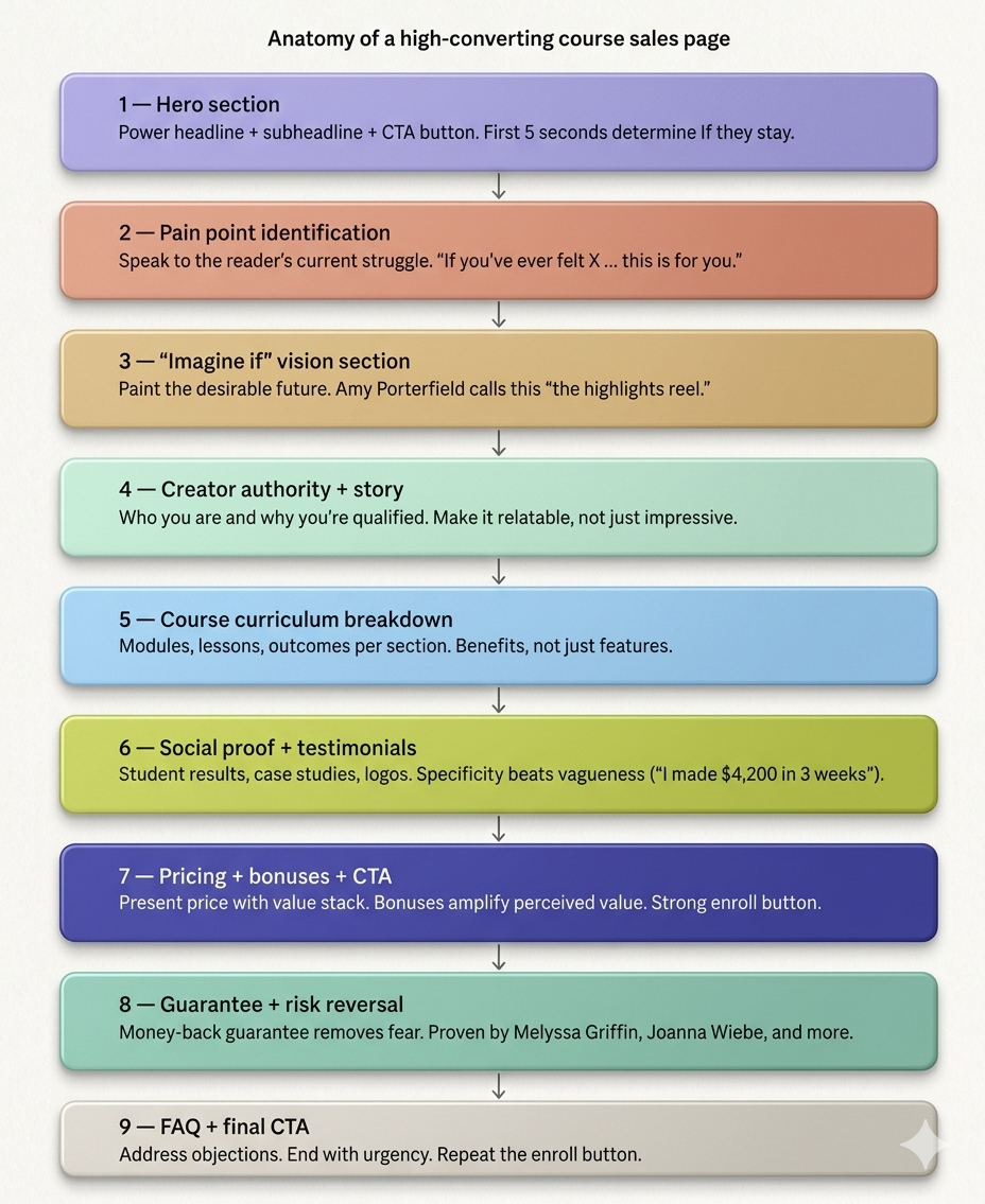
How to Create a Course Sales Page for Beginner Course Creators
Knowing what great sales pages do is one thing, but building one from scratch is another. This 11-step course sales page creation process is based on in-depth analysis of top course creators, expert conversion copywriters, and the recurring patterns found across high-performing pages.
Step 1: Do Your Audience Research First (Before Writing a Single Word)
Most beginner course creators open a blank Google Doc and start writing their sales page. That’s the wrong first move because the best sales pages aren’t written, they’re assembled from the exact words your audience already uses to describe their own problem.
Here’s why this matters. When a reader lands on your page and sees their own frustration described back to them in their own language, something shifts.
It no longer feels like a sales pitch. It feels like the page was written specifically for them. That feeling is what drives conversions, and you can’t manufacture it by guessing.
How and Where to Find the Pain Points of Your Audience:
- Talk to 5–10 real people: Reach out to people who fit your ideal student profile. It can be past clients, friends, people in your network, and ask them one question: “What’s the biggest challenge you face with [your course topic]?” Don’t suggest answers. Just listen, and write down their exact phrasing.
- Mine online communities: Go where your audience already gathers. For example, Reddit threads, Facebook Groups, YouTube comment sections, Quora answers, etc. Search for your course topic and read how people describe their struggles. Screenshot the ones that hit hardest.
- Study your competitors’ testimonials: Look at the reviews and success stories on other courses in your niche. The specific outcomes students mention — and the specific frustrations they had before enrolling — are pure gold for your copy.
After you collect real audience language, organize it into a document, and look for recurring patterns, emotions, and desired outcomes. Use this as your reference when you start creating your course sales page.
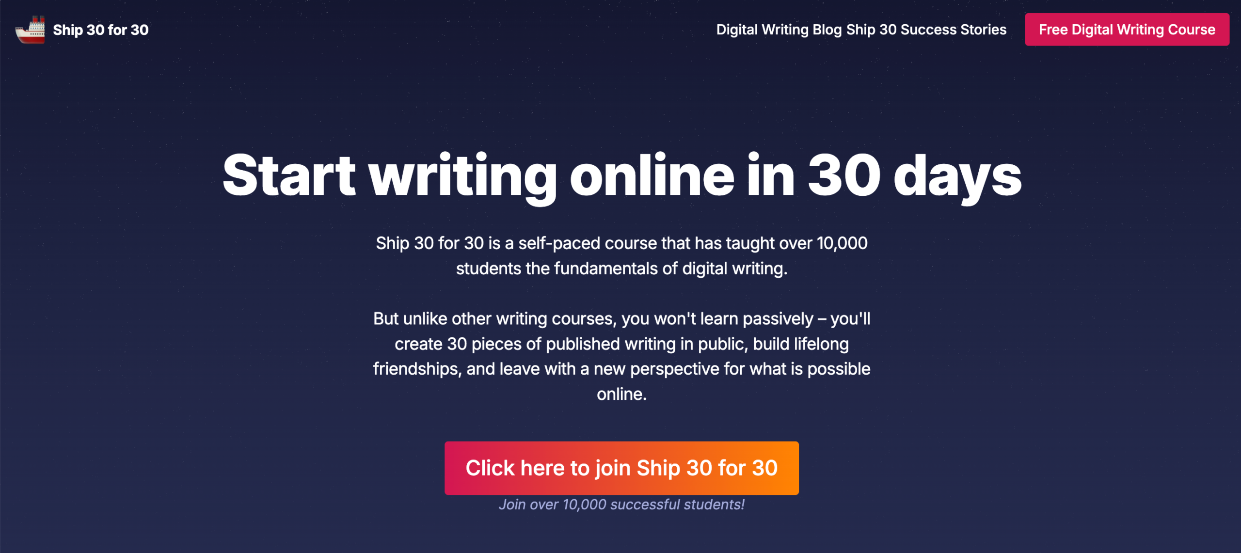
Step 2: Write Your Headline Using the “Benefit + Specificity” Formula
Your headline is the first thing a visitor reads. In most cases, it’s also the last because if it doesn’t immediately speak to something they care about, they’re gone.
Research consistently shows you have about five seconds to convince someone they’re in the right place. Your headline is doing all the work in those five seconds.
The mistake most beginners make is writing a headline that names the course or describes the format.
For example-
“Welcome to the Freelance Writing Masterclass.”
“A 6-week program for aspiring coaches.”
These aren’t headlines; they’re titles. They tell the reader what the thing is, not why it matters to them.
A great headline does one thing: it makes the right person feel seen and immediately curious. So, the simplest, most reliable structure for a course headline is this:
[Achieve specific outcome] + [timeframe or context] + [even if obstacle]
The first part states the result. The second part makes it feel achievable. The third part removes the most common reason someone would assume it’s not for them. Together, they create a headline that’s specific enough to be believable and compelling enough to keep someone reading.
A few examples of how this plays out in practice:
“Build a Profitable Freelance Business in 90 Days Even If You’re Starting From Zero”
“Learn to Write Online and Get Your First 1,000 Followers Without Posting Every Day”
“Launch Your First Digital Course in 60 Days Even If You Have No Audience Yet”
Notice what each of these does: it leads with the outcome the reader wants, not the process they’ll go through to get it. Nobody wakes up excited to watch course video modules. They wake up craving the result. Your headline should reflect that.
Once you nail the headline, you should think about a supporting subheadline directly below your main headline. It should be an additional one or two sentences that expand on the promise.
Think of it as the headline’s proof. It should answer the “how?” or “for whom?” in simple and specific language. Keep it to 30 words or fewer.
Common headline mistakes to avoid:
- Making a promise so big it feels unbelievable. Specificity is what makes a bold claim credible. “Make more money” is easy to ignore. “Land your first $3,000 client” is not.
- Being clever instead of clear. Wordplay feels satisfying to write and confusing to read. When in doubt, choose the plainer version.
- Using jargon your audience doesn’t use yet. If they don’t already know the term, it won’t resonate.
Write at least ten headline variations before you settle on one. It sounds excessive until you compare your first attempt to your tenth. They’ll barely look like the same page.
Step 3: Write the Pain-and-Empathy Section
By the time someone finishes reading your headline and subheadline, they’re intrigued but not convinced. The next question running through their head is a quiet, skeptical one: “Do you actually understand what I’m going through?”
Your pain-and-empathy section exists to answer that question with an unmistakable yes.
This is the part of the page where you stop talking about your course entirely and step into your reader’s world.
You describe the struggle they’re living right now. The frustration, the failed attempts, the gap between where they are and where they want to be. Done well, it creates an almost eerie feeling of recognition. The reader thinks: “How does this page know exactly what I’ve been feeling?” That feeling is trust, and trust is what makes people buy.
How to write it:
- Open with a scenario, not a statement: Instead of telling the reader they have a problem, put them inside the moment where they feel it. Paint a picture specific enough that the right person nods while reading it, and the wrong person moves on. Both outcomes are fine; your course isn’t for everyone.
- Name the feelings underneath the problem: Frustration. Self-doubt. The exhaustion of trying things that almost work. Go one layer deeper than the surface-level struggle. People don’t just want to feel understood; they want to feel seen.
- Close the section with a pivot: Signal that things don’t have to stay this way — without jumping into your solution yet. A single line is enough: “It doesn’t have to be this complicated.” or “There’s a reason it hasn’t clicked yet — and it’s not you.” This pivot creates just enough hope to carry the reader into the next section.
Here’s what this looks like in practice. Here’s the Pain-and-Empathy section from the course sales page of Justin Welsh:
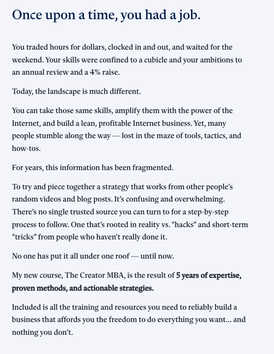
That’s the standard to aim for.
What to Avoid:
Do not list generic pain points. I mean things like:
“Feeling overwhelmed?”
“Struggling to find clients?”
Every course in every niche says something like that. What makes this section work is specificity. The kind that only comes from the audience research you did in Step 1.
That’s exactly why we started there.
Step 4: Paint the Future With Your “Highlights Reel”
You’ve just spent the previous section on the uncomfortable truth of where your reader is right now. This is where you show them where they could be.
Amy Porterfield, whose course sales pages have generated millions in revenue, calls this the “highlights reel.”
The idea is simple: instead of listing what your course covers, you paint a vivid picture of the specific, desirable moments that become possible once someone completes it.
In this section, being specific makes the difference.
“You’ll grow your freelance business” is a claim.
“You’ll wake up on Monday with three client inquiries in your inbox and the confidence to know exactly what to charge” is a highlight reel.
How to write it:
- Open with a transition that signals the shift in perspective. Something like “Now imagine this instead…” or “Here’s what becomes possible.”
- Then describe three to five specific scenarios, each one a snapshot of life after your course.
- Write them in the second person (“you”), in the present tense, and with enough detail that the reader can place themselves inside the scene.
Step 5: Build Your Authority Block
At this point in the page, your reader is feeling two things simultaneously: genuinely hopeful about the future you just painted, and quietly wondering who exactly is making these promises.
The authority block is where you answer that question. But the way most beginners answer it is exactly wrong.
The instinct is to list credentials. Degrees, years of experience, notable clients, impressive numbers. And while proof of expertise matters, a wall of accomplishments is not what converts a skeptical reader.
What converts them is relatability. Specifically, the moment they realize you were once exactly where they are now.
The most effective authority blocks don’t read like a LinkedIn bio. They read like the opening of a conversation. One that begins with “I know what you’re going through, because I’ve been there too.”
How to write it:
- Start with the struggle, not the success: Before you mention any achievement, briefly acknowledge where you started. The same frustration, confusion, or dead end your reader is currently sitting in.
- Walk the bridge: Show, in a few sentences, how you moved from that starting point to where you are now. You don’t need to tell the full story, just enough to make the journey feel real and replicable.
- Close with your credentials: Once your readers relate to you, it’s time to share what you have achieved. But frame them as proof of the outcome, not proof of your ego. Here’s the difference:
- Credential-first (weak): “I have an MBA, 12 years of experience, and have been featured in Forbes.”
- Outcome-first (strong): “Over the last four years, I’ve helped more than 2,000 freelancers land their first consistent clients and built the exact system I’m going to teach you inside this course.”
One thing to watch:
Keep this section shorter than it feels like it should be. Beginners tend to over-explain their background out of insecurity, as if more credentials will clear more doubt. They won’t.
Two to three short paragraphs are almost always enough.
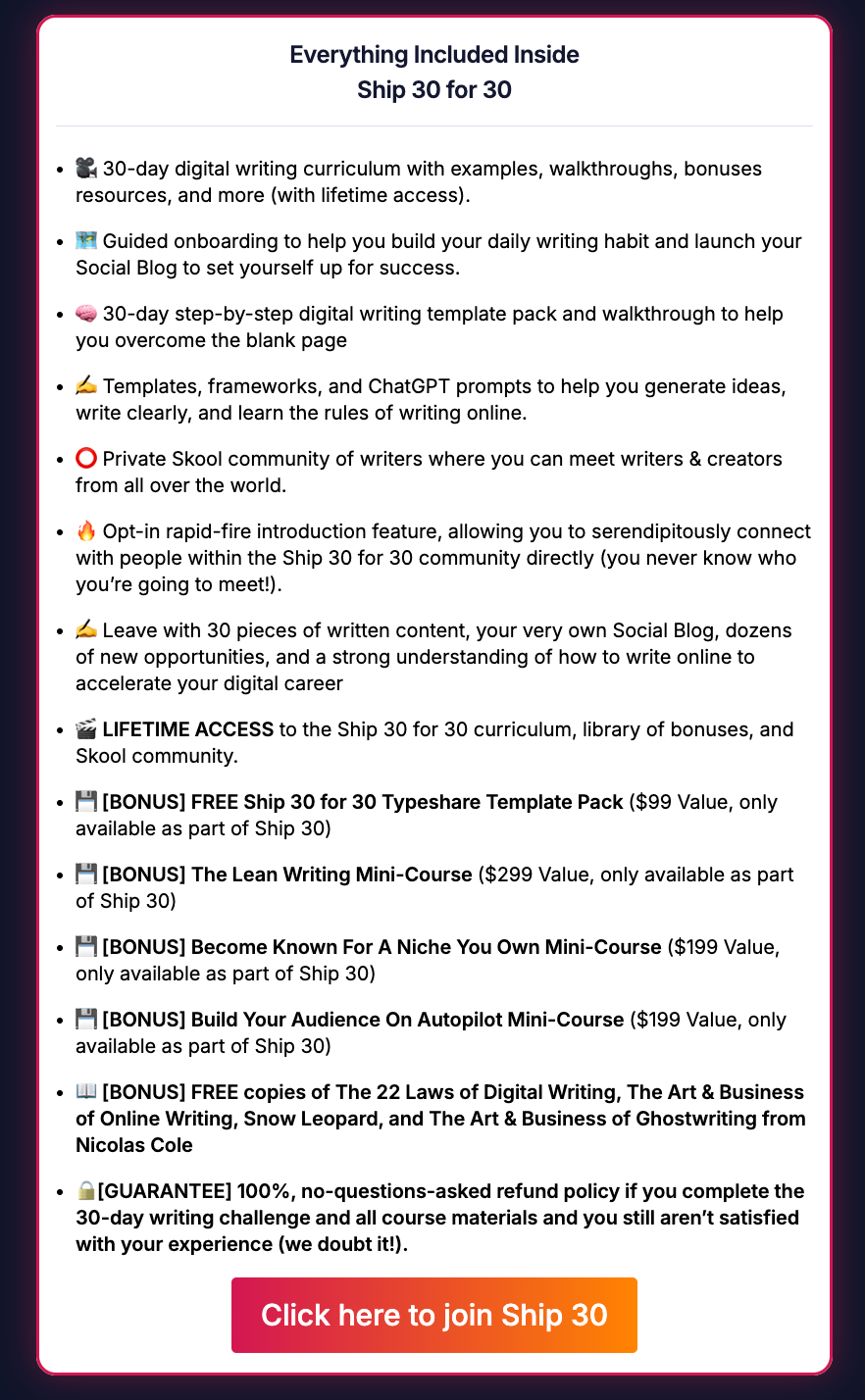
Step 6: Present Your Curriculum Benefits First
This is the section most beginners write first and best, and it’s almost always the weakest part of their page. Not because the content is bad, but because it’s written from entirely the wrong angle.
A curriculum section written from the inside out looks like this:
- Module 1: Introduction to Client Outreach,
- Module 2: Building Your Portfolio,
- Module 3: Setting Your Rates, and so on.
It’s accurate. It’s organized. And to your reader, it’s almost completely meaningless because it describes what they’ll go through, not what they’ll walk away with.
To make it more effective, flip the angle, and the same information becomes persuasive.
Here’s one simple rule for this: lead every module with the outcome, not the content.
For each module or section of your course, ask yourself: “What is the student able to do, decide, or feel differently after completing this?” That answer is your lead.
The content description follows as supporting detail. It’s the proof that the outcome is real and attainable.
Here’s what that looks like in practice:
“Module 2: Land Your First Client With Confidence
You’ll build a personalized outreach system that consistently gets responses, not by spamming strangers, but by approaching the right people with the right message at the right time. By the end of this module, you’ll have sent your first pitch and know exactly what to do when they reply.”
Compare that to:
“Module 2: Client Outreach Strategies. Topics include email templates, LinkedIn prospecting, and follow-up sequences.”
Both describe the same module. Only one makes someone want to enroll.
If your course has more than six or seven modules, don’t list all of them in equal detail. Give the most important two or three full treatments, and summarize the rest.
A reader who gets fatigued halfway through your curriculum list won’t make it to your pricing section, and that’s the one place you really need them.
At the end of your curriculum section, add a single line that captures the cumulative transformation. What someone has, knows, or can do having completed the entire course that they couldn’t at the start.
Step 7: Add Social Proof Strategically
By this point in the page, your reader is interested. They understand the problem, they can picture the outcome, they know who you are, and they’ve seen what’s inside the course.
But there’s one question they haven’t been able to shake since they arrived: “Has this actually worked for anyone else?”
That’s the job of social proof, and it’s one of the most powerful conversion tools on any sales page. That’s because it shifts the burden of persuasion away from you.
You telling someone your course is great is expected. A past student telling them, unprompted, that it changed how they work? That’s credible.
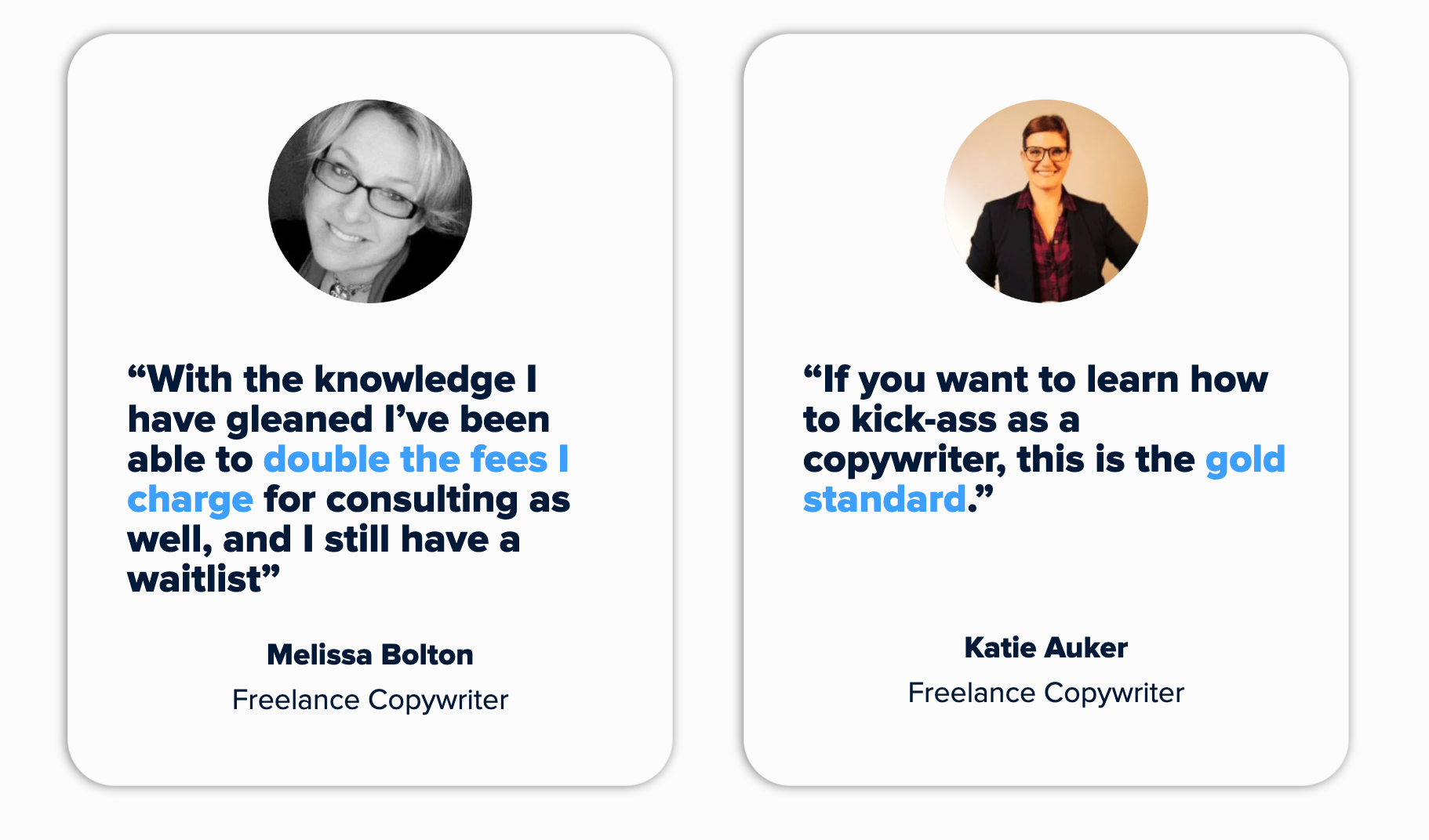
To create a strong social proof section, you need to keep in mind a simple rule: Specificity is everything.
“This course was amazing! Highly recommend!” is just generic, and your students might think it’s fake. As a result, they might just ignore it and move on because it tells them nothing they can hold onto.
What works is specificity. A real person describing a real, measurable shift in their life or work. The difference looks like this:
Weak: “I learned so much from this course. Worth every penny!”
Strong: “Three weeks after finishing the course, I landed my first $4,000 project. I’d been freelancing for two years before this and never charged more than $800.”
The second one works because it’s falsifiable. It names a number, a timeframe, and a before-and-after. That specificity is what makes it believable, and believability is what makes it persuasive.
Where to place testimonials:
Most beginners dump all their testimonials into one block near the bottom of the page. This is a missed opportunity. Spread them throughout the page and match each one to the doubt it’s most likely to resolve:
- Just below the hero section: To catch the early skeptic who’s already half-decided this isn’t for them. A strong result here buys you the rest of the page.
- Directly after your curriculum section: To answer the quiet question of “this sounds good, but does it actually work?” A specific, outcome-focused testimonial here bridges the gap between “interesting” and “I want this.”
- Right before or after your pricing: To address the most stubborn objection on any sales page: “Is this worth the money?” A student who mentions the return they got on their investment does more work here than any discount ever could.
What to do if you have no testimonials yet:
This is the most common anxiety for first-time course creators, and it has a straightforward solution: run a beta cohort or presell your course before your full launch.
Offer your course to a small group at a significant discount or even for free, in exchange for their participation, feedback, and a testimonial if they find it valuable.
The results don’t need to be dramatic to be useful. An honest account of the experience, what shifted for them, and what they’d tell a friend is more than enough.
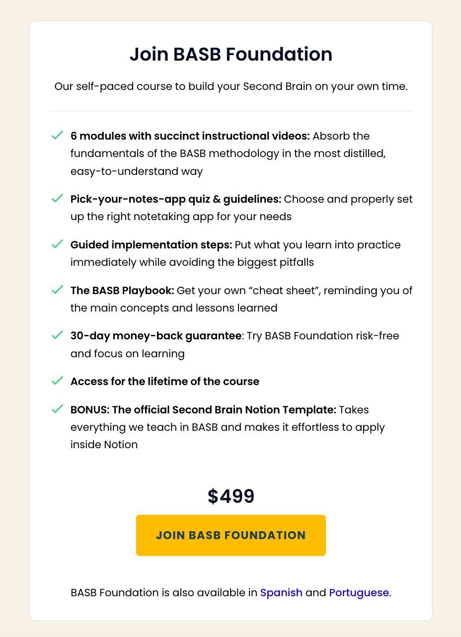
Step 8: Present Your Pricing and Value Stack
By the time someone reaches your course pricing section, they’ve made an emotional decision about whether they want what you’re offering. Your job now is to make sure the logical part of their brain doesn’t talk them out of it.
The way you frame your price matters as much as the price itself. Here’s how to get it right:
Lead with value, not the number
The single biggest mistake beginners make in this section is revealing the price before establishing what it’s worth. A number without context is always too high.
The same number, presented after a clear articulation of everything included, feels entirely different, sometimes even like a bargain.
This is where the value stack comes in. Before you show the price, list everything the student receives and attach an honest standalone value to each component. For example,
- The core course — $X
- Bonus workshop on [specific topic] — $X
- Downloadable templates and workbooks — $X
- Access to the private community — $X
- Live Q&A calls — $X
Then show the total combined value, followed by the actual enrollment price. The gap between those two numbers reframes the price from a cost into a deal.
It works because it gives the reader a concrete reference point for what they’re getting.
Frame price as an investment, not an expense
If your course helps people land higher-paying clients, point out that a single client pays for the course many times over.
If it saves hours of trial and error, calculate what that time is worth. If it delivers a skill that compounds over a career, say so.
You’re not inflating the value; you’re helping the reader see it clearly, which is something they genuinely struggle to do on their own when they’re staring at a price tag.
Offer tiers only if they’re genuinely different
Many course creators add pricing tiers because they’ve seen others do it, not because the tiers are meaningfully distinct. A basic tier and a premium tier that differ only in the number of Q&A calls are confusing.
If you’re going to offer more than one option, make sure each tier serves a clearly different type of student, and name them accordingly. When tiers are arbitrary, they create hesitation.
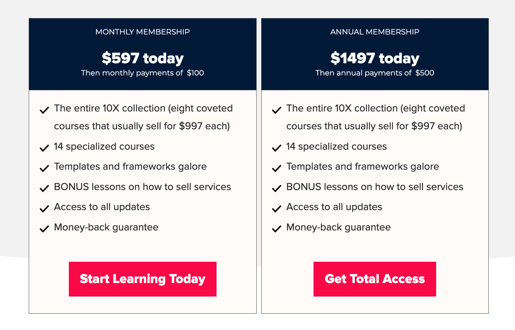
End with a single, clear CTA
After your pricing, there should be one obvious next step. One button, one action, one enrollment link. The copy on that button matters more than most people think.
“Enroll Now” is fine.
“Yes, I’m Ready” is better.
“Start Building My Freelance Business” is better still because it echoes the outcome, not the transaction.
Step 9: Add a Guarantee
Here’s a counterintuitive truth about money-back guarantees: they increase sales more than they increase refunds.
Most first-time course creators skip this step because they’re afraid of being taken advantage of. What they don’t realize is that fear is costing them far more in lost enrollments than a guarantee ever would in refunds.
Think about what’s happening in your reader’s mind at this point in the page. They want the outcome. They understand the value. They’re close.
But there’s one final hesitation that no amount of great copy fully eliminates: the fear of making a wrong decision.
A guarantee doesn’t just reduce that fear. It removes it entirely. And a reader with nothing to lose is a reader who enrolls.
A guarantee also tells the reader something about you, that you’re confident enough in your course to put your money behind it. That kind of transparency tends to make people more comfortable buying, not less.
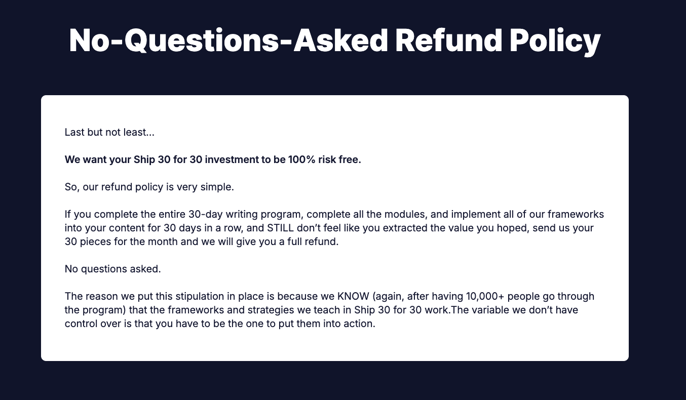
How to structure it:
Most course creators choose one of two approaches:
- No-questions-asked refund: The simplest and most reassuring for the buyer. Set a clear time window, typically 14 or 30 days, and honor it without friction. The straightforwardness of this approach is itself a trust signal.
- Results-based refund: You offer a refund if the student completes the coursework and doesn’t achieve the promised outcome. This is more common for higher-priced courses and protects against low-intent buyers, but it requires you to define “completion” clearly and enforce it consistently.
As a beginner, the no-questions-asked approach is almost always the right call. It’s simpler to communicate, simpler to honor, and removes the most friction for the largest number of potential buyers.
How to write it:
Don’t hide the guarantee in small print at the bottom of your pricing section. Give it its own visual block.
A distinct design element that stops the reader’s eye and makes the promise feel official. Write it in plain, warm language. Name the time window clearly. And resist the urge to surround it with conditions and caveats. Every qualification you add chips away at the trust you’re trying to build.
Step 10: Write Your FAQ Section
By the time a reader reaches your FAQ section, they’ve gone through your entire page. That means, they’re interested but there are still a few specific questions sitting in the back of their mind.
If these questions are left unanswered, those doubts are enough to make someone close the tab and think about it later. “Think about it later” almost always means no, which is why the FAQ section exists to clear those doubts.
The questions that you should include:
- Is this right for me if I’m a complete beginner? — Whoever your course is for, someone will worry they’re not ready. Address this directly.
- How much time do I need each week? — Time is the most common practical objection. Give an honest, specific answer.
- What if I fall behind? — Reassure them about lifetime access, self-pacing, or replay availability.
- I’ve bought courses before and never finished them. How is this different? — This is one of the most common unspoken fears. Acknowledge it honestly rather than dismissing it.
- Is this worth the price? — Don’t shy away from the money question. Answer it by pointing back to the outcome and the guarantee.
- What if it doesn’t work for me? — This is where you briefly restate your guarantee in one sentence.
How to write the answers:
Keep them short and direct. One to three sentences per answer is usually enough. Write them the way you’d answer a question from a friend: plainly, without overselling.
If a particular question allows you to include a relevant testimonial, use it. A real student answering “is this worth it?” in their own words is more persuasive than anything you can write yourself.
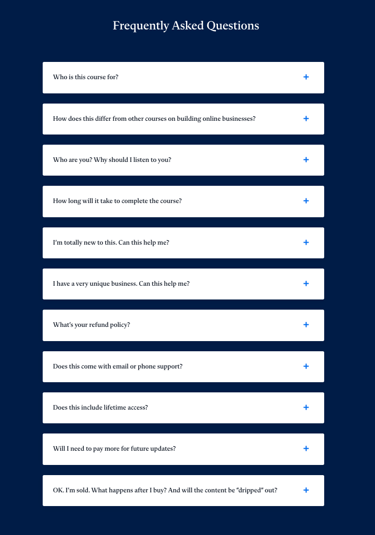
What most beginners get wrong:
Most beginners fill their FAQ with logistics. For example, “What platform is the course on?” and “How long do I have access?”
Those questions are fine to include, but they’re not what’s keeping someone from enrolling. The questions that actually matter are the ones about doubt, not details.
Step 11: End With a Final CTA and Urgency
Your final CTA is not just a repeated enrollment button. It’s the last thing your reader sees before they make a decision. This means it deserves as much thought as your opening headline.
By this point, the reader has everything they need to decide. Your job in this closing section is simple: summarize the transformation in two or three sentences, give them a clear reason to act now rather than later. And also, make the next step obvious.
Here’s how;
- Summarize the transformation briefly: Don’t recap the entire page. Just remind them, in plain language, of where they are now versus where this course takes them. One short paragraph is enough.
- Add a genuine urgency element: Urgency works when it’s real and falls flat when it isn’t. Readers can tell the difference between a countdown timer that resets every time they refresh the page and an enrollment window that actually closes. Stick to urgency you can honestly stand behind.
If none of those apply to your course, skip the urgency element rather than manufacturing one. A reader who feels manipulated doesn’t enroll — and doesn’t come back.
- Make the next step obvious: Place the CTA where the eye naturally lands after reading the closing paragraph. Also, write the button copy in terms of the outcome rather than the transaction.
Common Beginner Mistakes to Avoid
Most sales page mistakes come from skipping research, making assumptions, or following instincts that feel right but work against you.
Here are some common mistakes that you should avoid while creating your course sales page:
Writing the curriculum before understanding the audience
You finish building your course, open a blank doc, and start describing what’s in it, because that’s what you know best.
The problem is that your curriculum is built around what you want to teach, not around what your reader needs to hear to say yes. If you haven’t done your audience research first, your sales page will read like a syllabus.
Using jargon that your students don’t recognize yet
There’s a difference between jargon your audience already uses and jargon you’ve picked up from inside your niche.
Terms like “evergreen funnel” or “content ecosystem” might be second nature to you. But if your reader is early in their journey, that language creates distance rather than connection.
Burying the CTA at the very bottom
Your enroll button should not make its first appearance after eleven sections of copy.
People read sales pages in different ways. Some scroll straight to the price, some read every word, some jump around. Put your CTA in multiple places: near the top, after the curriculum, after the testimonials, and at the end. Every time someone is ready to say yes, the button should be right there.
Assuming your reader will just take your word for it
You know your course works, but your reader doesn’t know that yet. Telling them it works is not the same as showing them.
You need testimonials, specific outcomes, and real examples. The story your page tells has to lead them to that conclusion themselves, not ask them to accept it on faith.
Making the page too short or too long without rhythm
A one-page summary won’t convert a cold reader who needs context, credibility, and proof before they’re ready to buy. But a 5,000-word page with no visual breaks, no subheadings, and no variation in pace will lose people halfway down.
For course sales pages, length isn’t the issue, but rhythm is. Break up long sections with subheadings, pull quotes, and testimonials. Give the reader’s eye somewhere to rest.
Skipping the guarantee out of fear
Most first-time creators leave the guarantee out because they’re worried about refund requests. In practice, a clearly stated money-back guarantee reduces hesitation enough to bring in enrollments that would never have happened otherwise.
The math almost always works in your favor. If you’re skipping the guarantee, you’re limiting revenue.
Conclusion
A great course sales page is about understanding your reader well enough to meet them where they are. And then walking them, step by step, toward a decision that makes sense for them.
That’s really all it is. Clarity about who you’re talking to. Empathy for where they’re starting from. And enough structure to hold the whole thing together so the reader never feels lost or talked at.
The structure matters more than most beginners expect. You can have strong copy in every individual section, but if those sections aren’t in the right order, the page won’t work.
If you’re starting from scratch, don’t try to write the whole page in one sitting. Work through the steps in this post one at a time.
Get each section to a good enough place before moving to the next. A finished page that needs editing will always serve you better than a perfect introduction and nothing else.
And if you’re in the middle of building your page and something isn’t clicking, leave a comment. We read all of them.


Leave a Reply