Most courses don’t fail because the content is bad. They fail because the page selling the course doesn’t do its job.
A lot of creators treat their course page like a brochure and give it a headline, a syllabus, a price, and a “Buy Now” button, and then they wait.
But your visitor isn’t waiting for information. They’re deciding whether they trust you, relate to the problem, and believe the outcome is worth their money, all in a few seconds.
That’s where this guide comes in.
By the end of this article, you’ll know what actually makes a course page convert (hint: it’s not fancy design) and how you can create a landing page for your course.
But before that, let’s discuss the obvious – why a dedicated landing page is non-negotiable if you want course sales.
TL;DR
- To start selling your online course through landing pages, you need to research your ideal student’s real problems, desired outcomes, and objections so that your landing page speaks directly to their mindset and feels immediately relevant.
- When you create the landing page, clearly explain what makes your course different, focus on outcomes over features, and communicate the transformation in one simple sentence.
- On the landing page, make sure to highlight results, use social proof, keep copy scannable, and guide visitors with clear headlines and consistent calls to action.
- Also, remember to use a clean layout, strong visual hierarchy, mobile-friendly design, fast load times, and strategically placed CTAs to move visitors toward enrollment.
- Attract high-intent visitors, match pre-click and post-click messaging, reduce checkout friction, and continuously improve performance using analytics and testing.
Why You Need a Dedicated Landing Page to Sell Courses?
You need a dedicated landing page to sell online courses because landing pages are optimized for conversion. Unlike a regular website page, which often serves multiple goals at once, a landing page removes distractions and keeps the visitor focused on a single action.
Regular website pages typically include navigation menus, links to unrelated content, and broad messaging designed to appeal to many different audiences.
A course landing page, on the other hand, is intentionally narrow. It speaks to a specific type of learner, presents a clear promise, and leads the visitor step by step toward enrolling. There are no competing calls to action, no unnecessary detours, and no confusion about what comes next.
More importantly, a dedicated landing page allows you to shape the narrative. Instead of forcing visitors to piece together information from different sections of your website, you control the flow.
Core Components of a High-Converting Course Landing Page
A high-converting landing page isn’t about flashy design or clever copy. It’s about answering the right questions in the right order. So, a potential student feels understood, confident, and ready to enroll.
Below are the essential components every successful course landing page needs, along with simple examples to make them concrete.
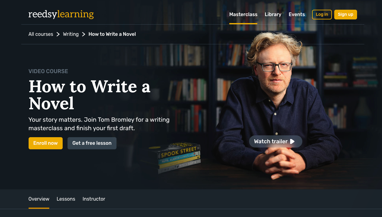
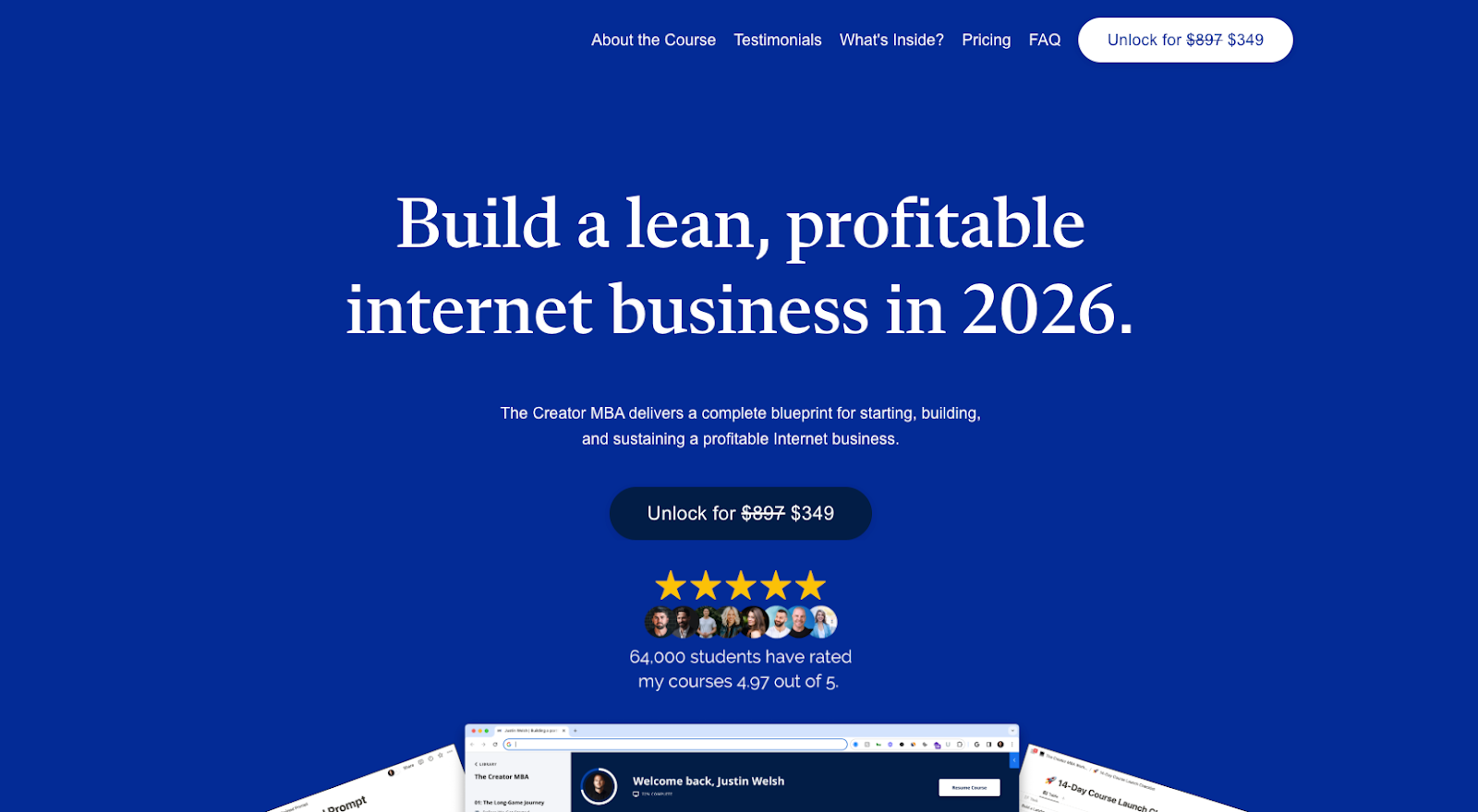
1. A Clear, Outcome-Focused Hero Section
The hero section is where most decisions start. Within a few seconds, visitors should understand what the course helps them achieve and who it’s for.
Instead of describing the course format or length, focus on the result.
Example:
❌ “A 12-module course on getting fit.”
✅ “Meet your ideal self in 90 days without torturing yourself.”
Support this with a short subheading that clarifies who the course is for and a visible call-to-action button.
2. Problem Awareness: Show You Understand the Student
People buy courses because they’re stuck. A strong landing page reflects that struggle to them, so they feel seen before they’re sold to.
This section should describe the problem in plain language, not exaggerated pain.
Example:
“You’ve watched free tutorials, saved dozens of posts, and still feel unsure where to start. The information is everywhere, but there’s no clarity.”
When visitors think, “That’s exactly me,” they keep reading.
3. Your Solution (Without Overexplaining)
Once the problem is clear, position your course as the structured path forward. This is not where you list every lesson, just explain how your course helps them move from problem to outcome.
Example:
“This course gives you a step-by-step system to go from obese to a healthy and active person in 90 days without torturing your body in the process.”
Think clarity over completeness.
4. Benefits Before Features
Features explain what’s included. Benefits explain why it matters. High-converting pages always lead with benefits.
Example:
❌ “10 video lessons, worksheets, and quizzes.”
✅ “Know exactly what to do each week—and see progress without feeling overwhelmed.”
You can still list features later, but only after visitors understand the value.
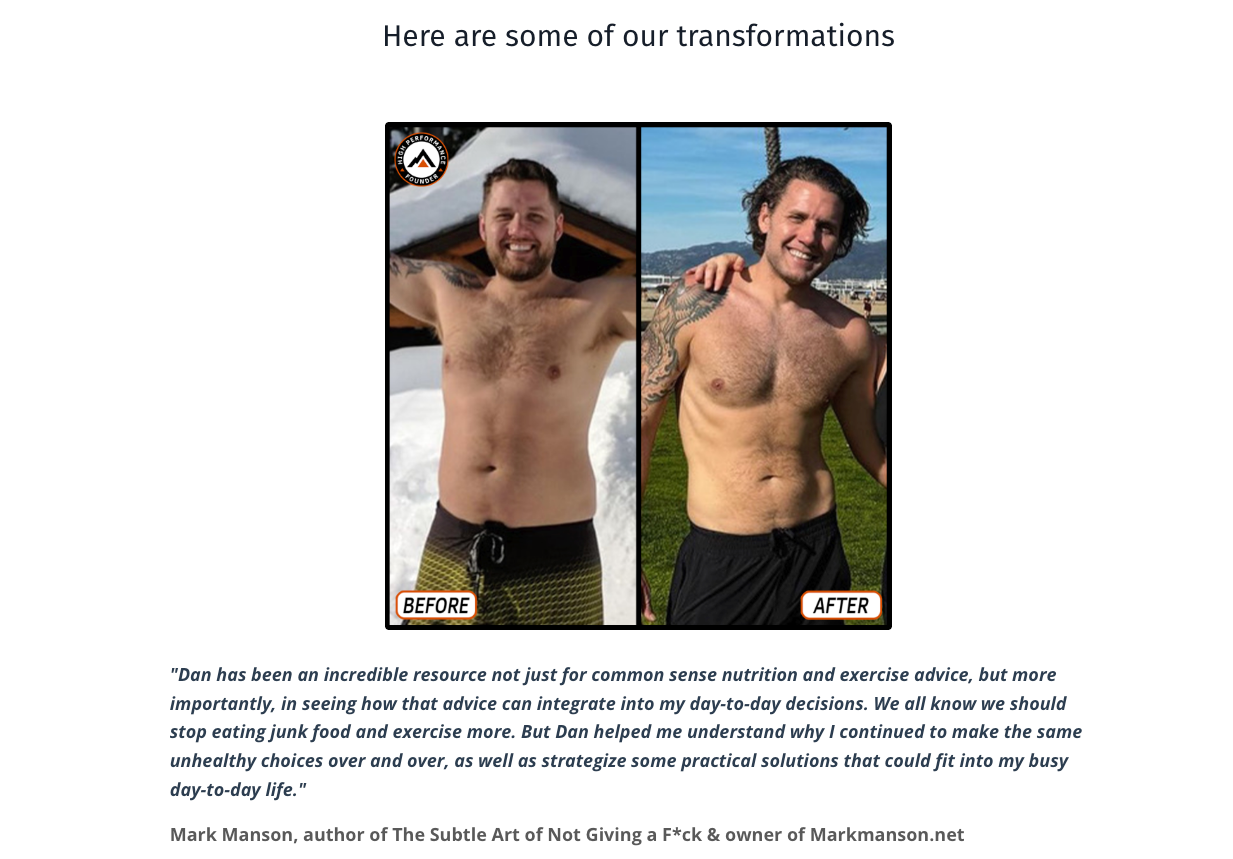
5. Social Proof That Feels Real
Trust is often the biggest barrier to buying. Social proof reduces that risk—especially when it feels relatable.
This can include:
- Student testimonials
- Before/after results
- Short quotes or screenshots
- Number of students enrolled
Example:
Or a simple testimonial:
“This was the first course that actually helped me overcome procrastination and work on myself.”
6. What They’ll Learn
Once trust is established, visitors want to know what they’re getting. This is where a simple curriculum overview helps.
Avoid long lists. Group lessons into outcomes.
Example:
Module 1: What makes people obese?
Module 2: What stops people from getting fit?
Module 3: Get into your best shape in 90 days.
This reassures visitors that the course is organized and intentional.
7. Clear Call-to-Action (Repeated Naturally)
A CTA should feel like the obvious next step. Place your CTAs after the hero section, after social proof, and near pricing or enrollment details
Example CTA copy:
- “Join the Course”
- “Get Instant Access”
- “Start Learning Today”
Each CTA should match the mindset of the section it follows.
8. Pricing, Risk Reversal & FAQs
Before committing, visitors want reassurance. The purpose of this section is to remove last-minute hesitation.
Include:
- Transparent pricing
- Refund or guarantee details (highly recommended)
- Short FAQs addressing common concerns
9. A Strong Closing Section
End the page by restating the transformation and inviting action without introducing new ideas.
Example:
“If you’re ready to stop overthinking and finally transform yourself in 90 days, this is your next step.”
CTA follows immediately.
How to Sell a Course Online Through a Landing Page in 6 Steps
Now that you’re clear about why you need a landing page and the core components of a highly converting landing page, it’s time to get going. In 6 careful steps, we’ll show you how to build your course landing page that converts.
Step 01: Audience Research (Know Your Ideal Student Before You Write a Word)
Before writing headlines, outlining sections, or designing layouts, it’s essential to understand exactly who the course is for. This step is often rushed, yet it has more influence on conversion than any design tweak or copywriting formula.
Knowing your ideal student goes far beyond basic demographics. Age, location, or job title might add context, but they rarely explain why someone is willing to pay for a course. What truly matters is understanding how your potential student thinks, struggles, and makes decisions.
To clarify this, focus on the following areas:
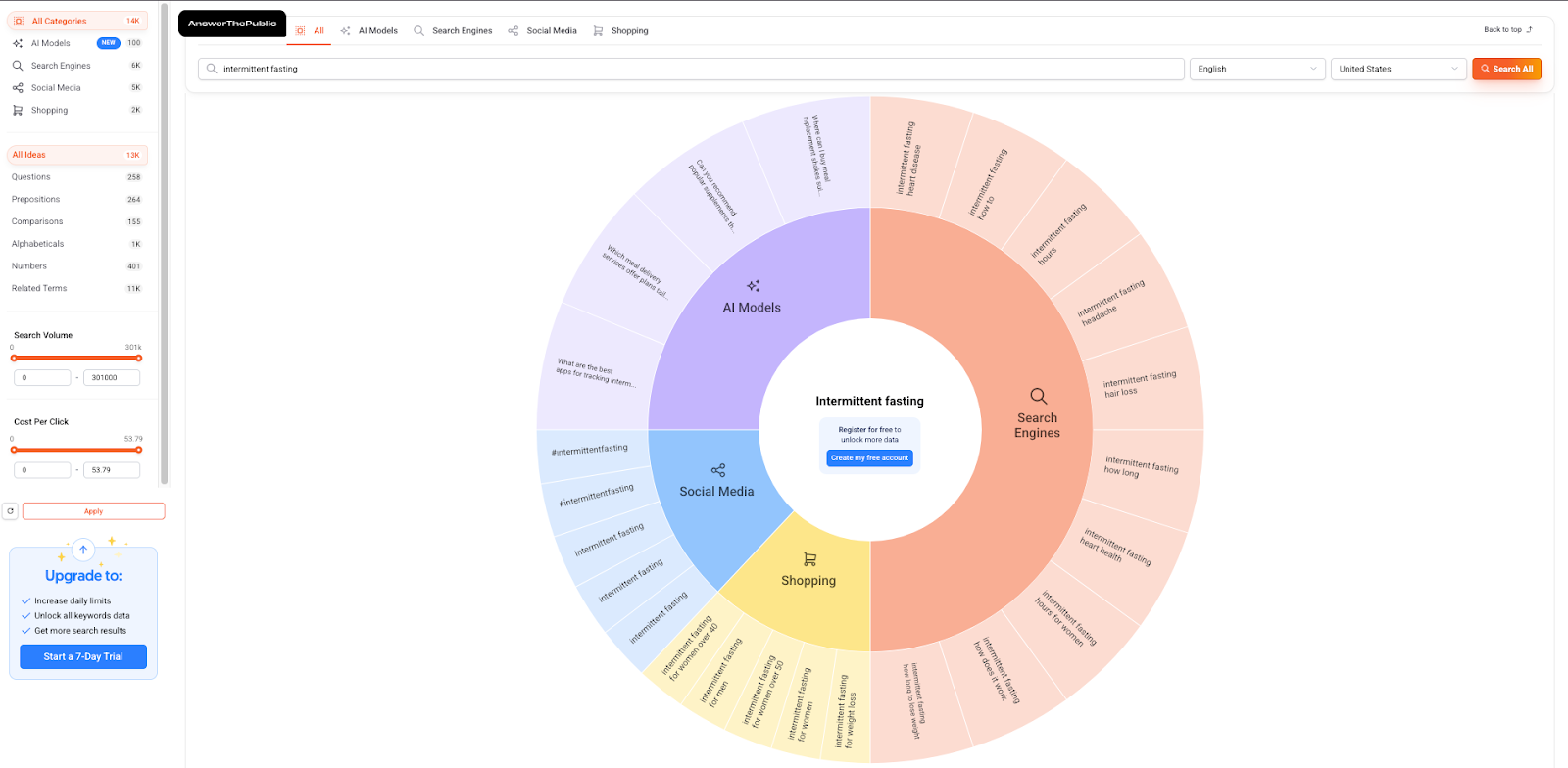
1. The Problems They’re Facing Right Now
No matter who your course is for, there are always some problems that they want to get rid of. And this desire is what leads them to look for a solution.
Ask yourself:
- What specific challenge led them to search for a solution?
- What have they already tried that didn’t work?
- Where do they feel stuck, frustrated, or uncertain?
You can check what potential students are searching for regarding your topic using platforms such as Answer the Public, Quora, Answer Socrates, etc. Include those on your landing page. When your landing page reflects these real struggles, it immediately feels more relevant and trustworthy to the reader.
2. The Outcome They Actually Want
People don’t buy courses for lessons or modules. They buy results. Identify:
- What success looks like for your ideal student
- How does their situation improve after completing the course
- Whether the desired outcome is tied to growth, confidence, income, clarity, or efficiency
Your landing page should consistently connect your course content to this outcome.
3. The Objections Holding Them Back
Even interested visitors hesitate. Common concerns include:
- “I don’t have enough time.”
- “I’ve tried similar courses before and failed.”
- “I’m not sure if this will work for me.”
Addressing these objections directly through copy, FAQs, or reassurance reduces friction and builds confidence.
When you have a clear picture of your ideal student, writing becomes more natural. Instead of trying to appeal to everyone, you’re speaking directly to one person who feels understood. That sense of relevance is often what turns a casual visitor into a committed student.
Step 02: Defining Your Unique Value Proposition (UVP)
Once you understand your ideal student, the next step is to define why your course is the one they should choose. This is your Unique Value Proposition (UVP). A strong UVP must clearly communicate the transformation your student will experience.
Focus on three key elements:
- What makes your course different: Identify what sets your course apart from others on the market. Is it your teaching method, your step-by-step system, your support, or your track record of helping students achieve results?
- Turning features into outcomes: Your course may have specific features—modules, templates, video lessons—but features alone don’t sell. Frame each feature in terms of what it helps the student achieve. For example, “12 video lessons” becomes “12 lessons that guide you from zero knowledge to creating your first professional portfolio.”
- Writing a simple, one-sentence UVP: Distill the essence of your course into a single, clear sentence. This statement should instantly answer the visitor’s question:
“Why should I enroll in this course instead of any other?”
Example format:
“This course helps [ideal student] achieve [desired outcome] by [your unique approach].”
A compelling UVP ensures that every section of your landing page (ie, headline, copy, visuals) reinforces the same promise. When done right, it positions your course as the obvious, relevant choice for your audience.
Step 03: Craft Content That Persuades and Reassures
Once you know your ideal student and UVP, your next priority is content. Your goal is to make your landing page clear, credible, and convincing without overloading your visitors with information. Focus on the essentials:
Key Principles to Keep in Mind
- Highlight Transformation, Not Features: Instead of listing modules, emphasize what the student will achieve. Visitors want to know how their lives or skills will change after completing your course.
- Use Social Proof Wisely: Testimonials or brief success stories help visitors feel confident in their decision. Even one strong example is often enough.
- Create a Clear Call to Action: Your copy should naturally guide the reader to enroll. Keep the language simple and consistent, and repeat the CTA in logical places without cluttering the page.
Writing and Visual Tips
- Headlines and Subheads Matter: Use them to communicate your key benefit quickly. Avoid overcomplicating with multiple formulas. Just make the value obvious in a single line.
- Keep Text Scannable: Use short paragraphs, bullet points, and bold highlights to make reading effortless. Most visitors skim first and read selectively.
- Support Your Message with Visuals: Include a brief course introduction video or a relevant image. Visuals should reinforce your promise, not distract from it. Simple graphics or screenshots are often more effective than long videos or complicated infographics.
Step 04: Design Your Landing Page for Conversion
The way your landing page looks and flows can make or break conversions. Good design isn’t about flashy visuals—it’s about guiding your visitor naturally from interest to action.
Layout and Page Structure: Your page should follow a clear visual hierarchy. Place the most important information first, and use headings and sections to guide the visitor from the problem they’re facing, to the solution your course provides, to proof that it works, and finally to the call to action. Above the fold, visitors should immediately understand what the course is, who it’s for, why it matters, and how to take action.
Mobile-Friendly Design: Most visitors browse on mobile, so your page must be thumb-friendly. Buttons should be easy to tap, content should fit small screens, and essential elements should remain visible without forcing users to scroll excessively.
Call-to-Action (CTA) Optimization: Your CTA is the decisive moment. Use clear, confident language that removes hesitation, like “Enroll Now” or “Start Learning Today.” Place at least one button above the fold and repeat it strategically throughout the page.
Speed, Performance, and Technical Basics: Even the most compelling page won’t convert if it’s slow or buggy. Optimize images, keep layouts clean, and remove unnecessary elements to improve load times. Use relevant keywords, include FAQ sections, and add alt text to images so that search engines can easily find your page
Fast and search engine-optimized pages bring in more traffic and keep visitors engaged.
Step 5: Drive the Right Traffic and Guide Visitors to Enroll
A high-converting landing page can only sell if the right people arrive there in the first place. This is where many course creators get frustrated. They build a solid page, but conversions stay low because the traffic doesn’t match the offer.
Selling a course through a landing page isn’t just about design or copy—it’s about aligning traffic, message, and intent.
Focus on Traffic With Buying Intent
Not all traffic is equal. Some visitors are just curious, while others are actively looking for a solution. Your goal is to bring people who already feel the problem your course solves.
The highest-intent sources usually include:
- Your email list: Subscribers already trust you and are more likely to buy.
- Content tied to the problem: Blog posts, videos, or social posts that address the exact pain your course solves.
- Paid traffic (once validated): Ads work best after you know your offer converts.
A strong landing page amplifies intent. It doesn’t create it from scratch.
Match the Message Before and After the Click
One of the biggest conversion killers is message mismatch.
The promise that brings someone to your landing page must match what they see when they arrive. If your email, ad, or post talks about solving a specific problem, the headline and opening section of your page should continue that same conversation.
When the message feels consistent, visitors feel oriented and understood. When it feels different, they hesitate even if the offer is good.
Clarity builds trust. Trust drives sales.
Reduce Friction at the Point of Purchase
Once someone decides they want the course, nothing should get in the way.
Keep the buying process simple:
- Make pricing clear and upfront.
- Minimize steps between interest and enrollment.
- Avoid unnecessary distractions on the checkout path.
- Use reassurance elements like guarantees or clear access details.
Every extra question or click is a chance for doubt to creep in. The easier it feels to enroll, the more people will complete the purchase.
Use Pre-Selling When the Course Requires More Trust
Not every course should be sold directly from a cold landing page—especially if the price is higher or the outcome is significant.
In these cases, your landing page can act as:
- A registration page for a webinar or workshop
- A waitlist or early-access page
- A lead-in to a short email sequence that builds confidence
This approach allows you to warm up potential students before asking for the sale, increasing conversion rates and reducing refunds.
Think of Your Landing Page as Part of a Sales System
A landing page doesn’t work in isolation. It sits inside a broader journey from discovery to trust to decision.
When traffic source, message, page content, and checkout experience are aligned, the landing page stops being “just a page” and starts functioning as a reliable sales asset for your course.
That alignment is what turns visits into enrollments.
Step 06: Optimize Your Landing Page After Launch
Launching your landing page is just the beginning. Most course creators stop here, but post-launch optimization is key to maintaining conversions and building trust.
Tracking What Matters
Keep an eye on metrics like conversion rate, scroll depth, and engagement. Tools such as Google Analytics, Hotjar, or your platform’s built-in analytics can show where visitors drop off and what keeps them interested.
Continuous Improvement
Test high-impact elements first—headlines, CTAs, and pricing. A/B testing helps you make decisions based on data, not guesswork. Even small, data-driven tweaks can significantly improve results over time.
Post-Purchase Experience
Your thank-you page should set clear expectations and outline next steps, reinforcing the value of the course. Onboarding should guide students in a way that builds confidence and reduces overwhelm. Send follow-up emails reminding students about lessons, resources, or community opportunities to keep engagement high and help reduce refunds.
Creating a Landing Page Using Klasio Page Builder
A high-converting course landing page isn’t built overnight, but by following these steps, you can create a page that speaks directly to your ideal student, builds trust, and drives action.
If you want a faster, easier way to launch high-converting landing pages, Klasio Page Builder has you covered.
You can customize the existing templates to match your branding, add extra sections, or highlight unique course features. Or if you want even more control, Klasio lets you build a landing page from scratch.
With Klasio Page Builder, creating a professional, conversion-focused landing page doesn’t require technical expertise or a team of designers. Everything is drag-and-drop, flexible, and optimized to help your course attract and convert the right students.
FAQs
What is the Best Platform to Sell an Online Course?
The best platform to sell an online course for beginners is Klasio. There are also platforms such as Teachable, Thinkific, and Podia with a higher learning curve. For more control and customization, you can go for WordPress with an LMS plugin. And if you’re looking for advanced automations and funnels, you can use Kajabi.
Read more: Best Free Platforms to Create Online Courses
How Do You Get People To Buy Your Online Course?
To get people to buy your online course, focus on solving a real problem, building trust with social proof, and having a clear, compelling landing page. Promote via email, social media, or webinars, and optimize continuously.
How Do You Get People To Buy Your Online Course?
Courses that sell the most online usually teach practical skills or solve urgent problems, such as business, tech, creative skills, health, and personal development. Niche topics with passionate audiences also perform well.
Read more: Most Profitable Niches for Online Courses
How Much To Charge For Online Courses?
When it comes to how much to charge for an online course, there’s no single “correct” price. Most successful courses are priced based on the outcome they deliver, not the number of lessons. Beginner courses often fall in the lower range, while specialized or career-focused courses can be priced higher.
Can I Pay Someone to Create an Online Course for Me?
It’s not a good idea to pay someone to create an entire online course for you. The expertise must come from you. Many creators hire help for filming, editing, slide design, or structuring the content. However, students buy the course for your knowledge and experience. Outsourcing execution is fine, outsourcing expertise is not.


Leave a Reply