With the release of Klasio’s drag-and-drop page builder, you can now create amazing pages for your course website effortlessly. In this documentation, we will give you a brief overview of how to access the page builder and its basic components.
Accessing the Page Builder
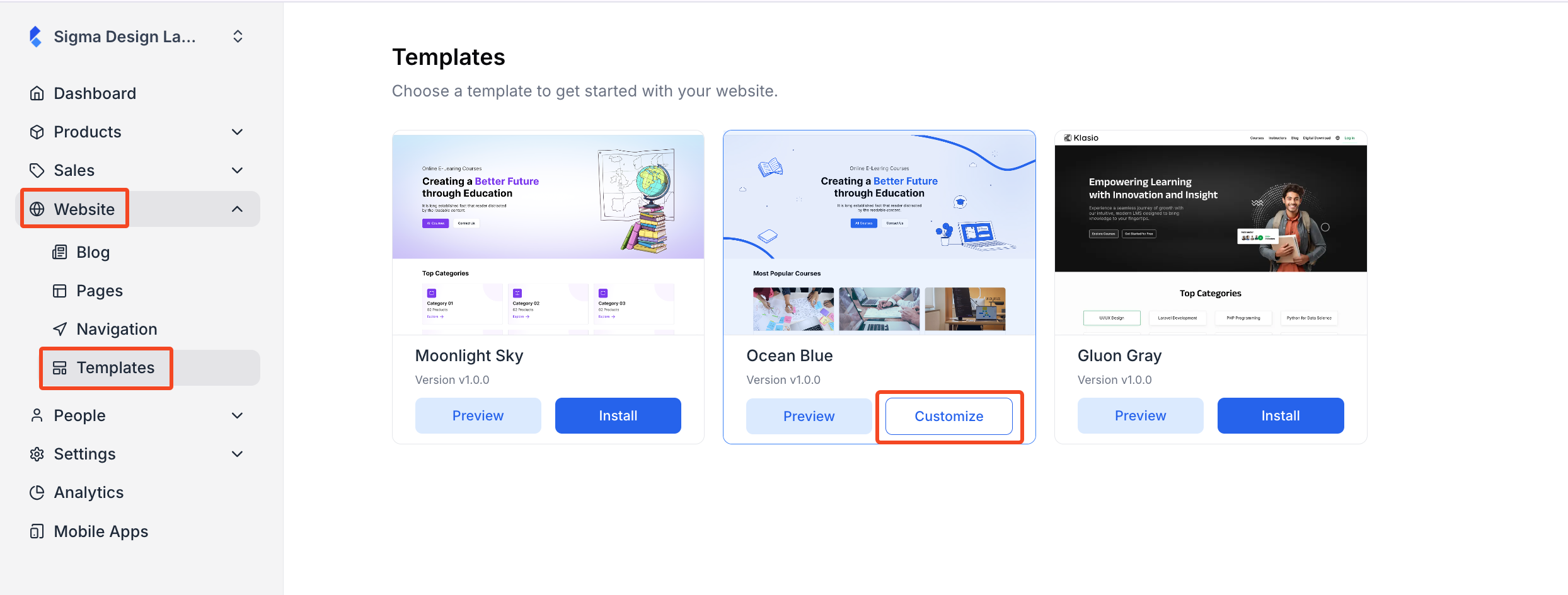
From the dashboard, expand “Website’ and click on “Templates.” Then, in the new window, you will see all the templates you have. The template you are using currently will have a “Customize” button on its card. Click on the “Customize” button to access the page builder. If you want to customize a different theme, then you will have to install that theme first and then customize it.
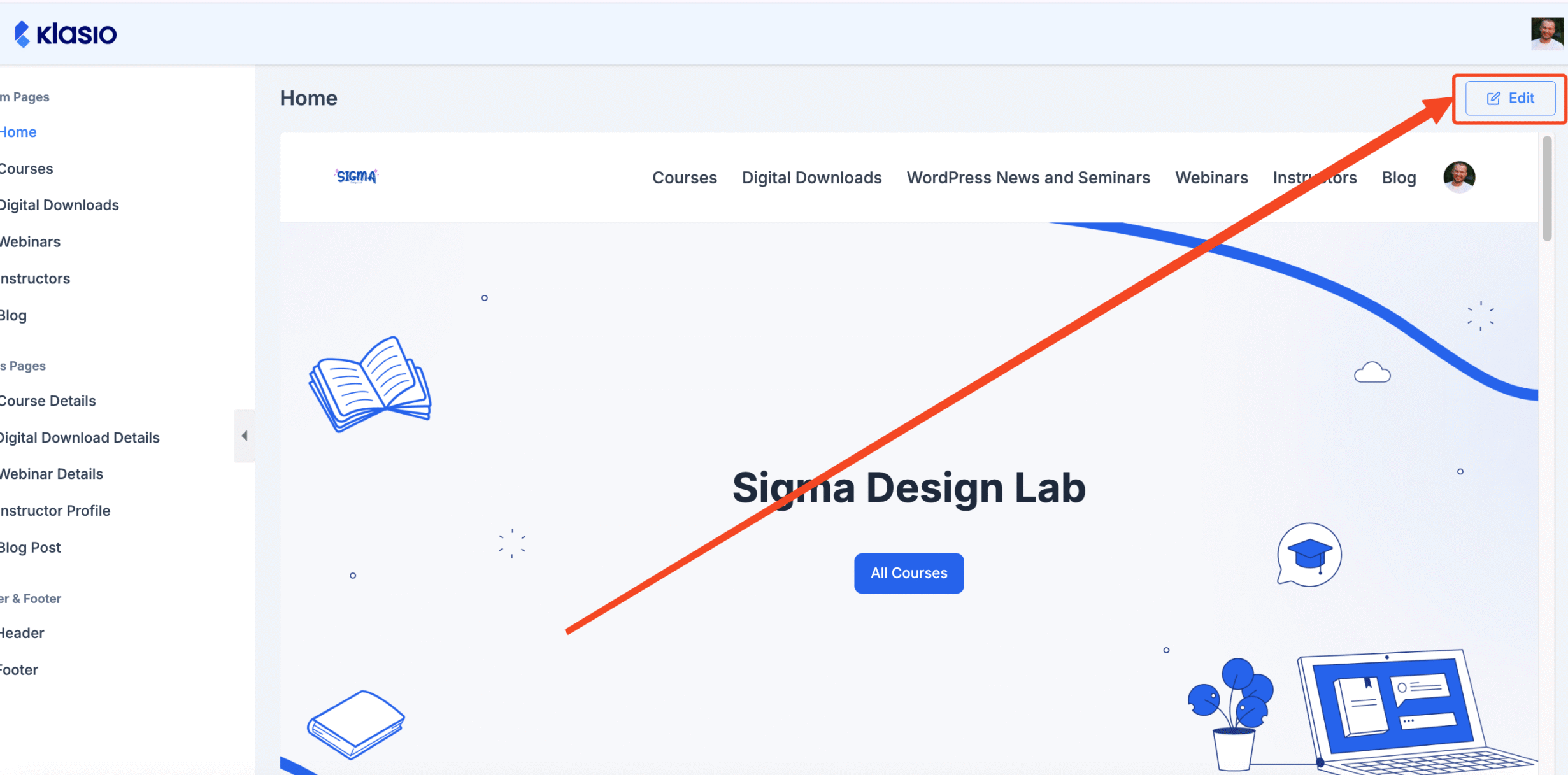
After you do so, you will be taken to the page builder with a list of all the system pages, template pages (i.e, Course Details), header, and footer that are currently live on your website. Choose the page you want and click on the “Edit” button on the top right, and you will be able to access the page builder.
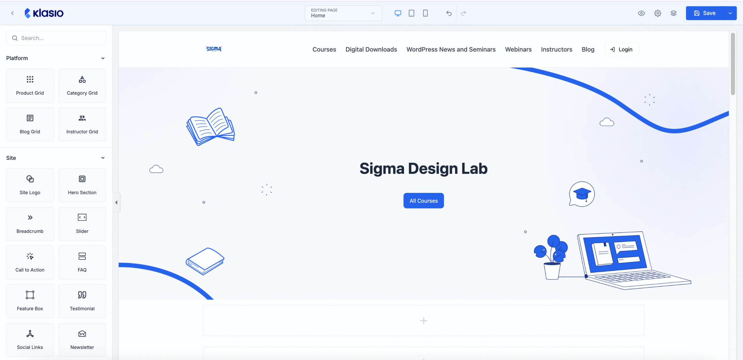
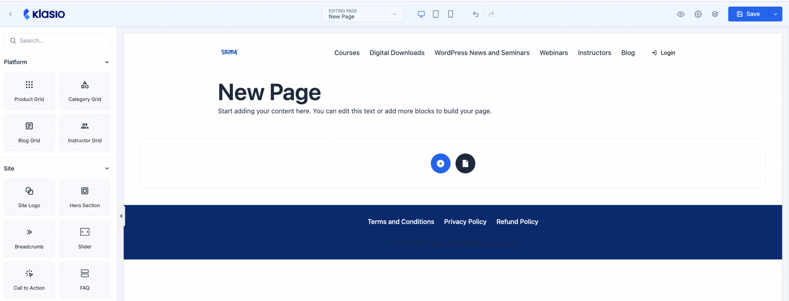
And the builder will look something like this:
Adding and Customizing a New Page
Instead of customizing a system page, if you want to add a new page and edit it with the builder, follow the steps below:
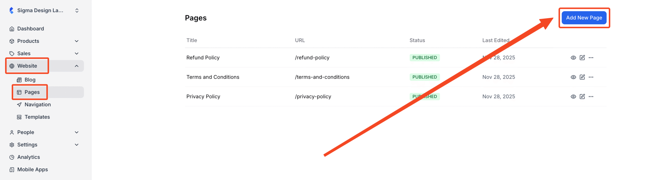
1. From the dashboard, go to Website > Pages. From there, click on the “Add New Page” button on the top right.
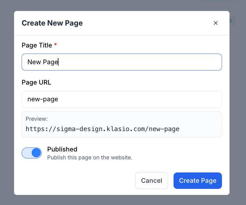
2. Then, a popup will appear, where you will have to enter the name of the new page. The page URL will be automatically generated based on the page name. Also, there is a toggle to make the page published or a draft. Once you have provided all the necessary information, hit the “Create Page” button.
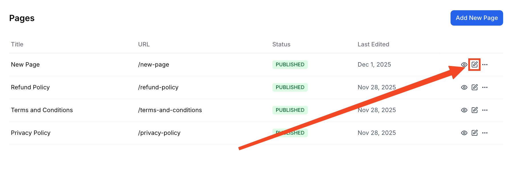
3. After creating the page, find the new page from the list of pages and click on the “Edit” icon to edit the page with the page builder.
4. Then you will be taken to the page builder.
Page Builder Elements Overview
Once you access the page builder, you will see that there are different elements for you to use. To be precise, there are 25 elements that you can use by just dragging and dropping them to the page. These elements are categorized so it’s easier to use and understand.
Platform
The platform section is for dynamic grids. These grids will take information from your website and display it dynamically. You have 4 dynamic grids at your disposal.
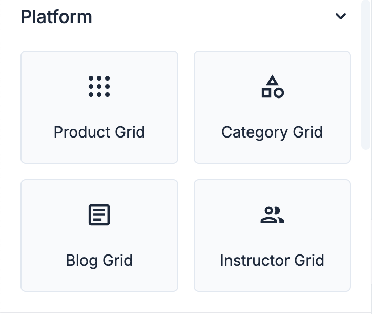
- Product Grid: Displays a selection of products in a grid layout. This is ideal for showcasing multiple items from your store on a single page.
- Category Grid: Shows different product categories in a visually organized grid. It helps users easily navigate to the category they are interested in.
- Blog Grid: Arranges your blog posts in a grid format. This element is perfect for creating a blog index page or highlighting recent articles.
- Instructor Grid: Presents a list of instructors or authors in a grid. Each entry can include a photo, name, and a brief bio.
Site
The Site section provides high-level components used to build the main structure and key interactive parts of your pages. These elements help define your brand’s identity and guide users through your website. You have 10 site-wide elements at your disposal.
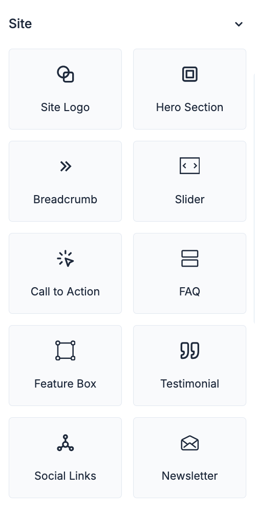
- Site Logo: Adds your site’s logo to the page. This element is typically used in the header or footer of a page.
- Hero Section: Creates a large, prominent section at the top of a page. It’s designed to grab the user’s attention with a compelling image and a call to action.
- Breadcrumb: Adds a navigational trail to your page. This helps users understand their location on your site and easily navigate back to previous pages.
- Slider: Creates a slideshow of images or content. This is a great way to showcase multiple pieces of content in a limited space.
- Call to Action: A button or link that encourages users to take a specific action. This could be anything from “Buy Now” to “Learn More.”
- FAQ: Displays a list of frequently asked questions and their answers. This helps to address common customer queries and reduce support requests.
- Feature Box: Highlights a specific feature or service. It typically includes an icon, a headline, and a short description.
- Testimonial: Showcases a quote from a satisfied customer. This is a powerful way to build trust and credibility with potential customers.
- Social Links: Adds icons that link to your social media profiles. This makes it easy for users to connect with you on different platforms.
- Newsletter: A form that allows users to subscribe to your email newsletter. This is a great way to build your email list and keep your audience engaged.
Basic
The Basic section contains the fundamental building blocks for all of your content. These are the essential elements you will use most frequently to add text, images, and structure to your pages. You have 10 basic elements at your disposal.
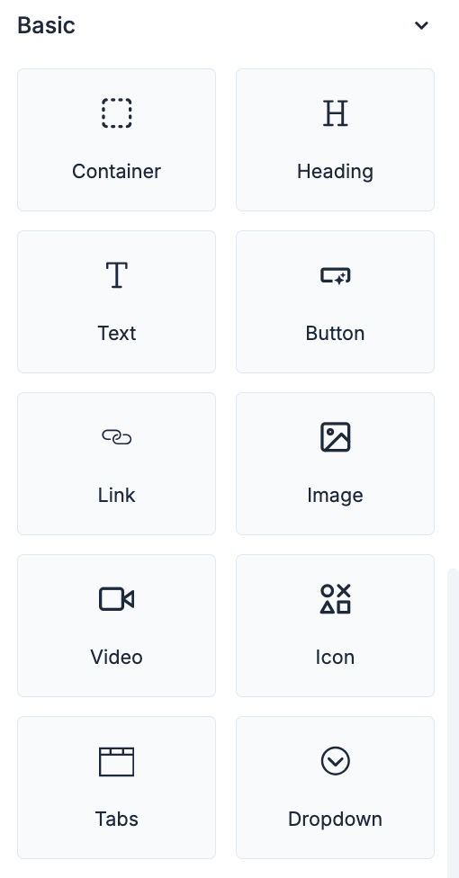
- Container: A basic building block that holds other elements. It helps to structure your page and control the layout of your content.
- Heading: Adds a title or subtitle to a section of your page. Headings are important for organizing your content and improving readability.
- Text: A simple block of text. This can be used for paragraphs, descriptions, or any other written content.
- Button: Creates a clickable button. Buttons are used to trigger actions, such as submitting a form or navigating to another page.
- Link: Creates a hyperlink to another page or website. This allows you to connect your content to other relevant resources.
- Image: Adds an image to your page. Images can be used to visually enhance your content and break up large blocks of text.
- Video: Embeds a video from a source like YouTube or Vimeo. Videos are a great way to engage your audience and convey information in a dynamic way.
- Icon: Adds a small, symbolic image to your page. Icons can be used to visually represent actions or ideas.
- Tabs: Organizes content into a set of clickable tabs. This is a great way to display a large amount of information in a compact space.
- Dropdown: Creates a dropdown menu of options. This is useful for navigation or for selecting from a list of choices.
Advanced
The Advanced section is for users who need more control and customization over their page. It currently offers a way to directly embed custom code. You have 1 advanced element at your disposal.
- HTML: Allows you to add custom HTML, CSS, or JavaScript code directly to your page. This is for advanced users who want to add unique functionality or styling that is not available through the standard elements.
Theme Settings
In the top-right corner, there is a gear icon, which includes the Theme Settings. The Theme Settings panel allows you to define the global styles for your entire website. The settings you configure here will create a consistent and professional look across all your pages, ensuring that elements like colors, fonts, and buttons are uniform unless individually overridden.
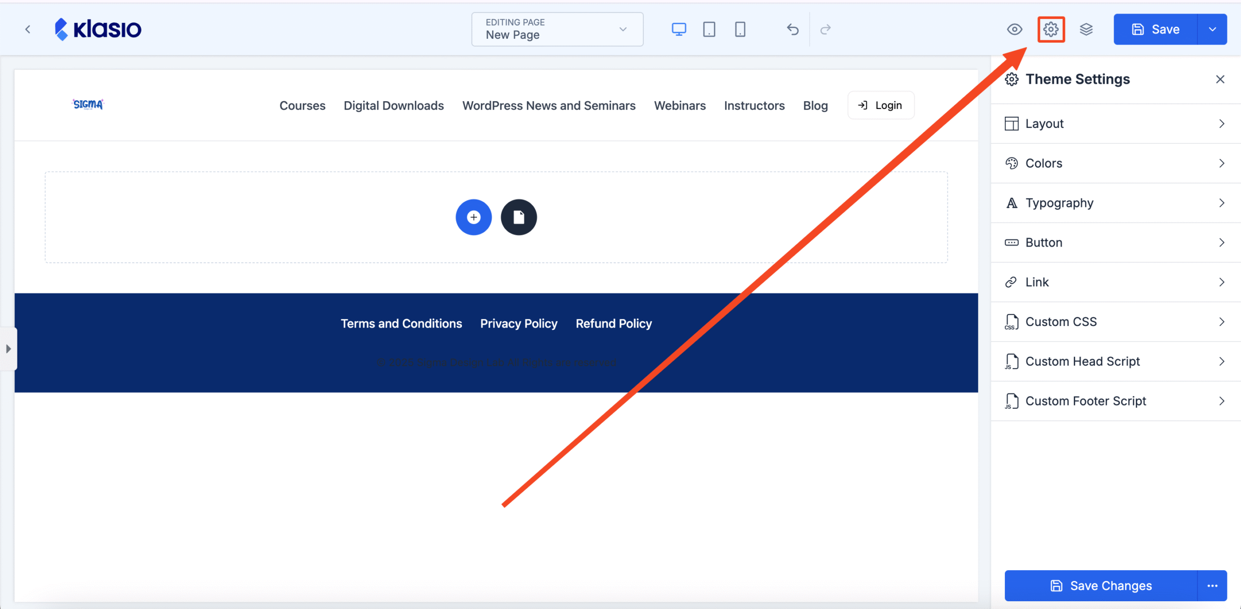
- Layout: Controls the overall structure of your site’s pages. Here you can set default page widths, container spacing, and other foundational layout properties to ensure a consistent structure.
- Colors: Define your website’s global color palette.
- Typography: Manage your site-wide font styles for headings, paragraphs, and links.
- Button: Customize the default appearance of all buttons on your site.
- Link: Set the default styling for all hyperlinks.
- Custom CSS: Add your own custom CSS code to apply advanced styling across your entire website.
- Custom Head Script: Insert custom scripts into the
<head>section of your website. - Custom Footer Script: Add custom scripts just before the closing
</body>tag of your site.
Mobile Responsiveness
In the top-middle, you will see three icons: a desktop, a tablet, and a mobile. These icons are for checking the mobile responsiveness of your webpage.
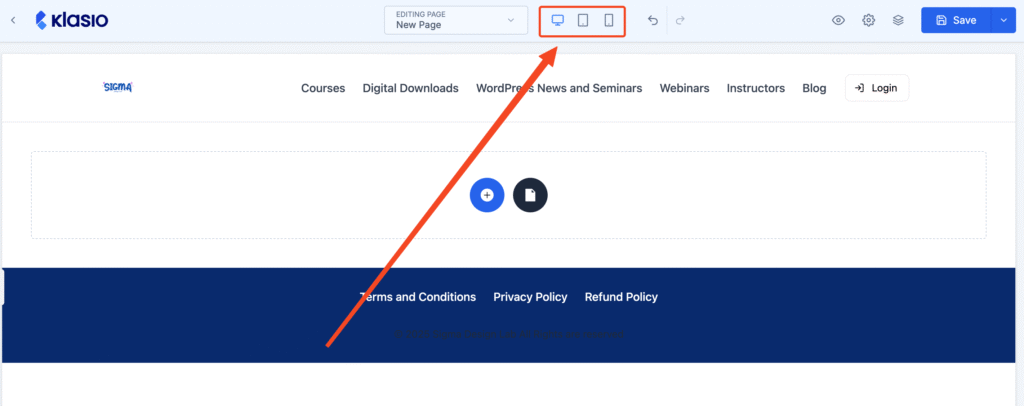
You can check what your page looks like on different devices and customize it accordingly.